Clean Theory
Lab-grown skincare rebrand

(01) Overview
Clean Theory case study by Raster: a warm rebrand for a lab-grown skincare company, with a custom serif and a Type Makers Guild award.
A lab-grown skincare company that looked like a lab. We rebranded it to look like something you would want on your shelf.
01 / Challenge
Great science, cold brand. Customers trusted it but did not want it in their bathroom.
02 / Approach
A warm mono palette, a custom serif for headlines and motion that moves like a slow pour.
03 / Result
A Type Makers Guild award, and a relaunch that doubled repeat orders.



Fig. 01 to 03
The new brand and the new product share one grid: twelve columns, an 8-point rhythm and one easing curve for every transition.
(03) Credits
Four people, ten weeks.
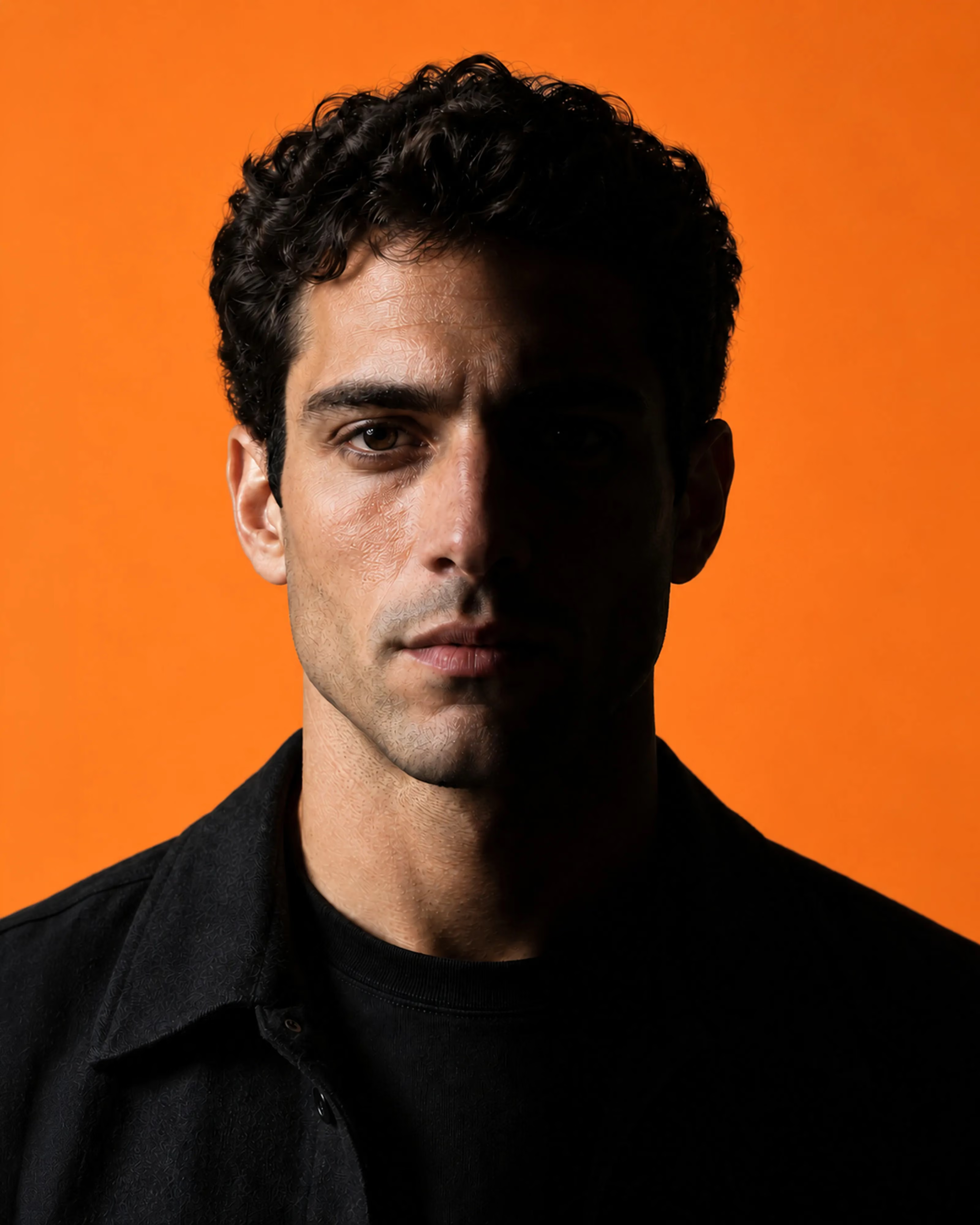
Creative direction
Luca Brandt
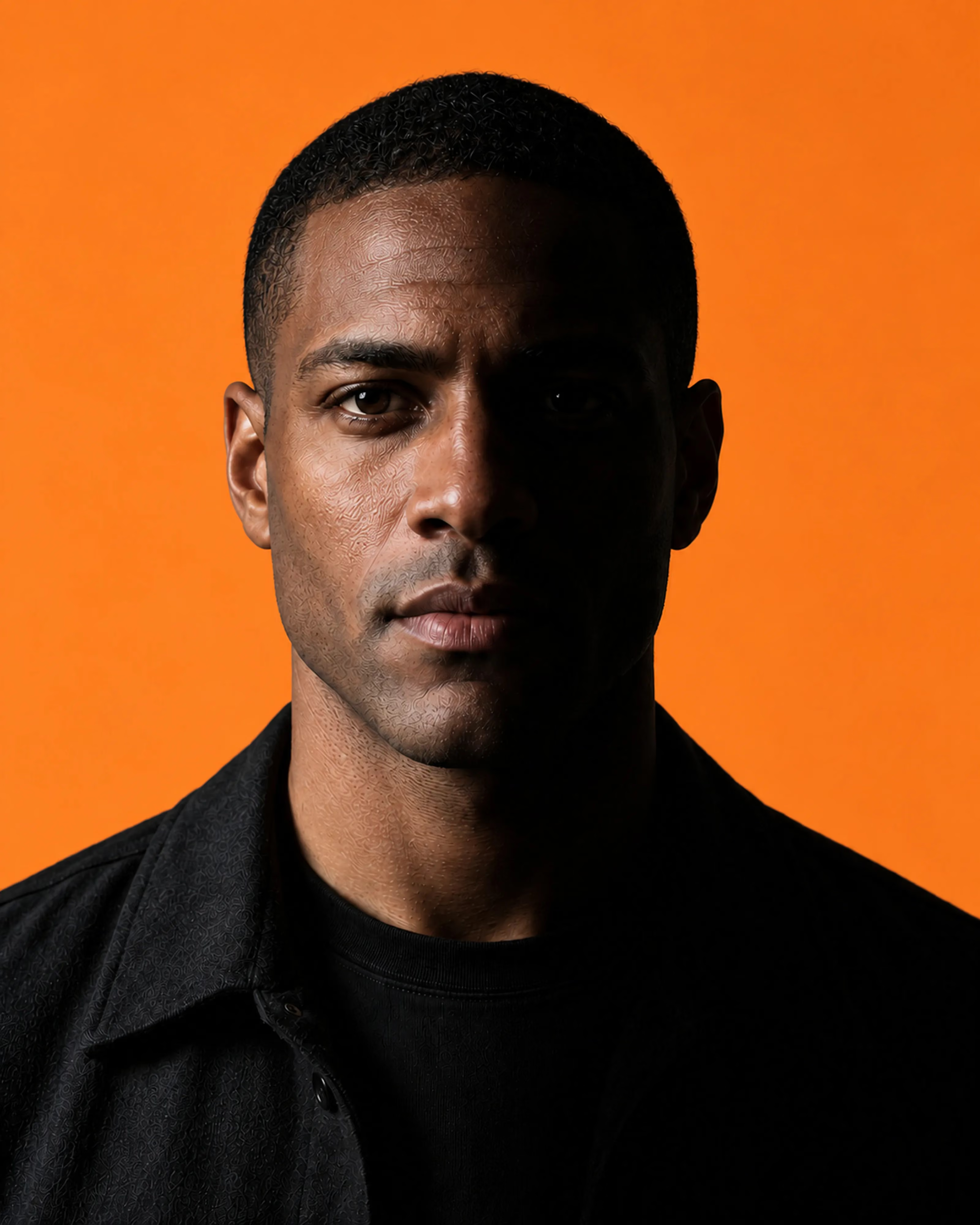
Design
Tomás Reyes
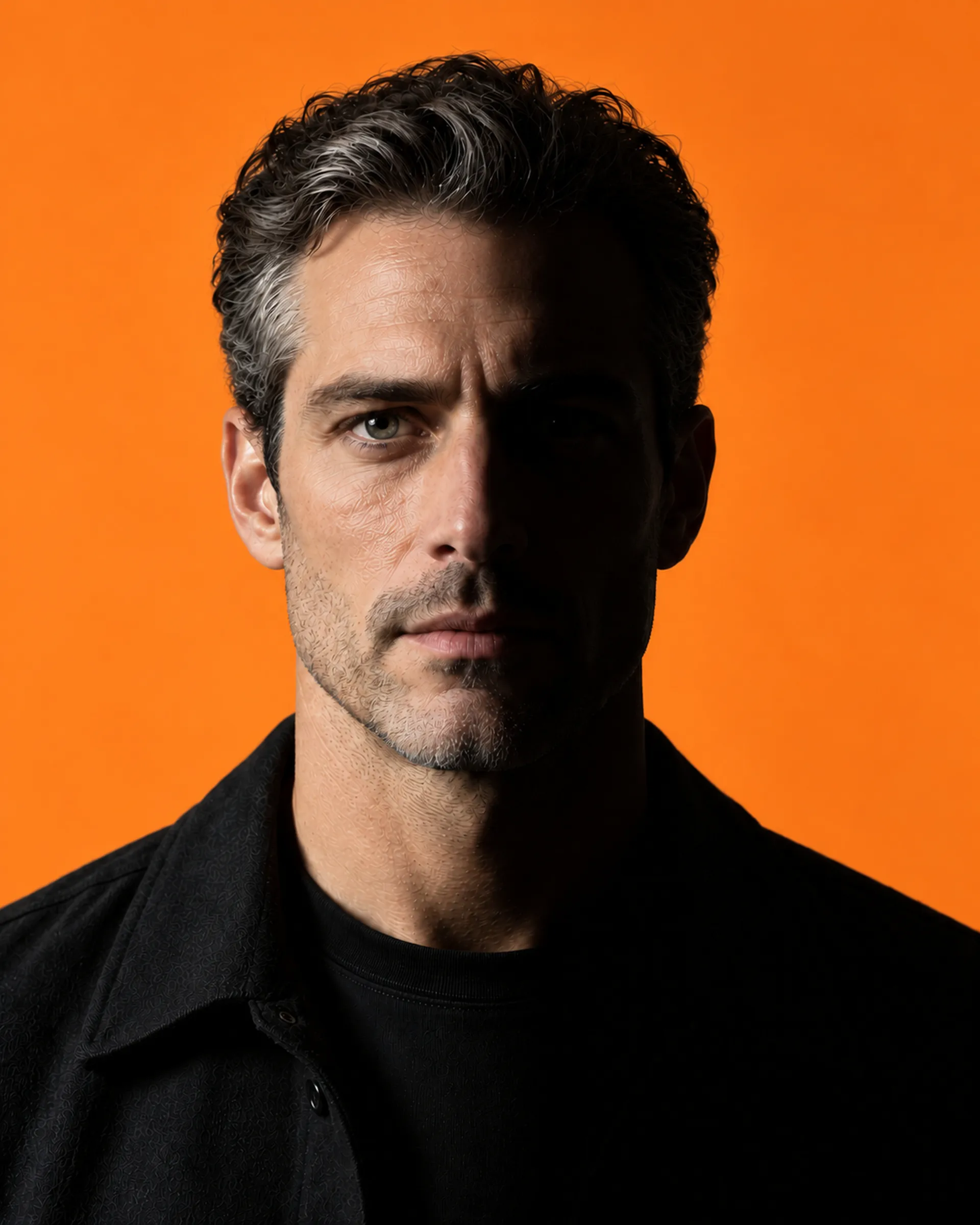
Development
Noah Haddad
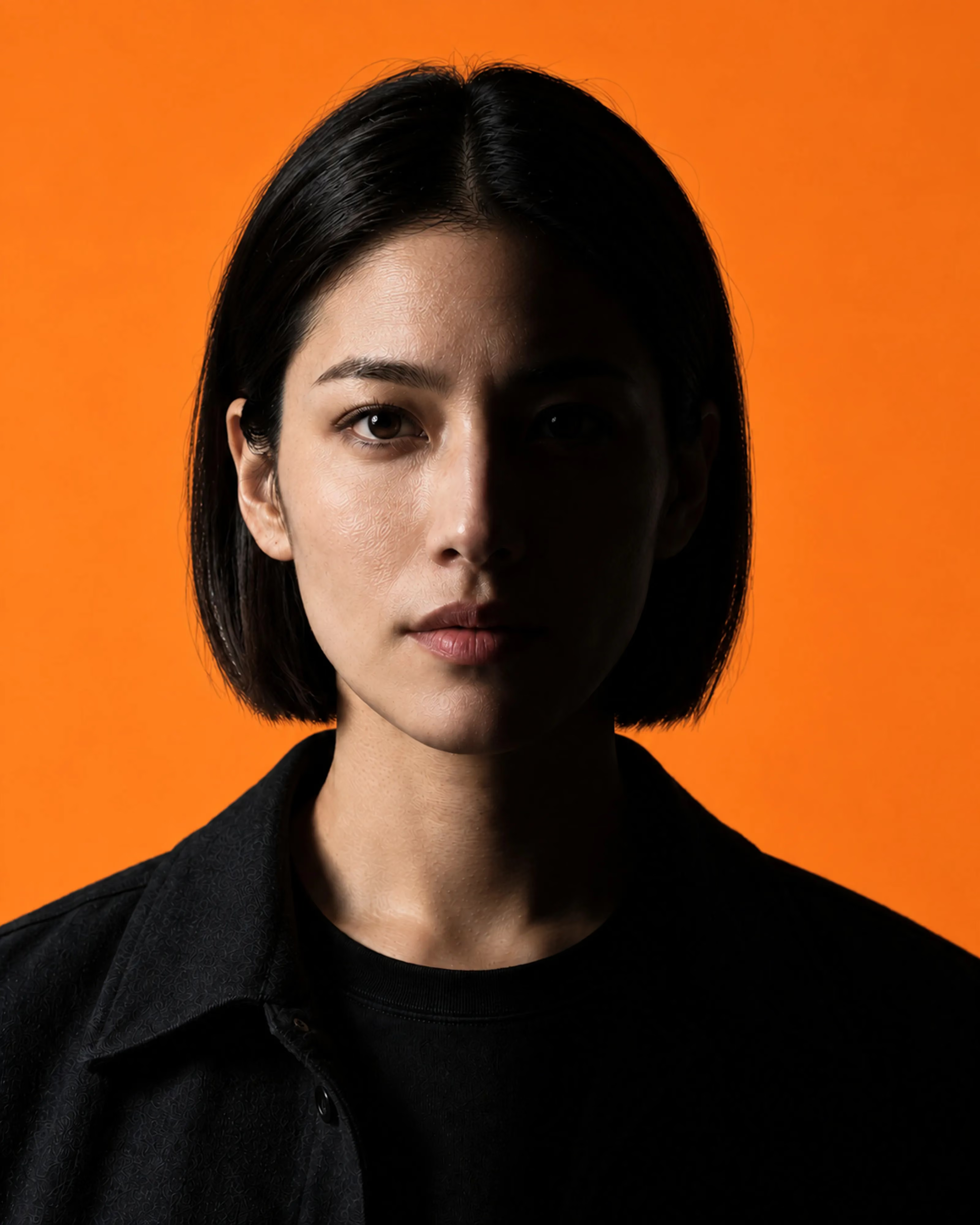
Motion
Elena Wren
Start a project
Let's talk.
Thanks, your brief is with us. We reply within two working days.
Your brief did not send. Check the fields and try again, or write to mail@example.com.